At some point, every brand hits the same website moment.
Nothing is broken.
The content is still accurate.
The site still works.
It just doesn’t feel like you anymore.
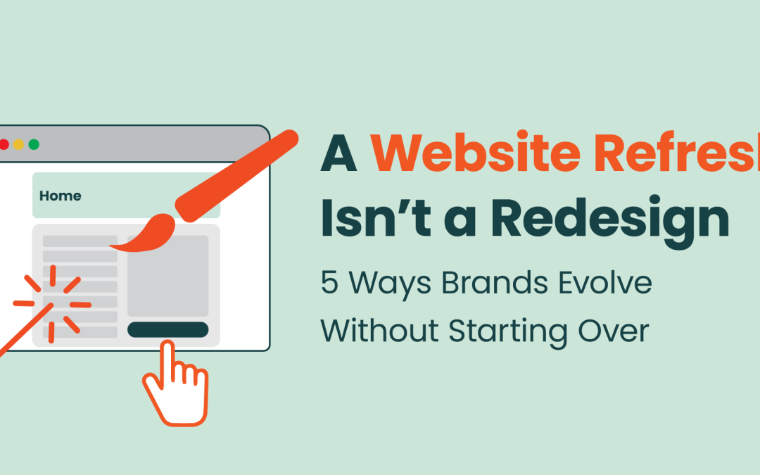
That’s usually when teams start talking about a redesign. But more often than not, starting over isn’t the answer.
A website refresh focuses on refining how a brand shows up visually and structurally, without throwing away what already works. From a design perspective, it’s about alignment — making sure the experience matches who the brand is today, not who it was a few years ago.
We’ve seen this firsthand through recent refresh work on Firebrand’s own site and recent refreshes we’ve done for clients. In all cases, the goal wasn’t reinvention. It was clarity, consistency, and confidence.
Here are five ways brands can evolve their websites without starting from scratch — and why this approach often delivers more impact than a full redesign.
1. Use Movement to Clarify Your Story and Keep People Engaged
When a website starts to feel outdated, it’s often because it feels static.
Even with strong messaging, a static homepage can struggle to quickly communicate what a brand does or encourage visitors to keep scrolling. From a design standpoint, this usually isn’t a content problem — it’s an experience problem.
For Firebrand’s refresh, the homepage hero video became a key update. Instead of relying entirely on text to explain our services, the video provides a quick, high-level snapshot of what we do and how we work. It gives visitors immediate context and adds movement that keeps the page feeling active.
Movement isn’t just about video, though. Subtle animation and light interaction help create flow as users move through a page as well as draw attention to critical branding or messaging. Small transitions, hover states, or content easing into view make the experience feel more responsive and intentional.
Hover over icon for interaction
Importantly, the overall structure of the homepage didn’t change. The difference was in how the site behaves. From a design perspective, this is a good example of how evolution can improve engagement without requiring a redesign or new messaging. Sometimes, a single update like this is enough to make a homepage work harder.
2. Refine How Brand Elements Are Applied Across the Site
Design refreshes often get mistaken for brand changes. In practice, they’re usually about improving how existing brand elements are used.
As brands mature, visual systems need refinement. Colors that once felt expressive can start to feel heavy. Typography styles may become inconsistent across pages. Small misalignments add up over time.
From a designer’s perspective, a refresh is an opportunity to bring discipline back to the system.
On Firebrand’s site, the refresh didn’t introduce new brand colors or fonts. Instead, we refined how those elements were applied. Color usage became more intentional. Typography felt more consistent across pages. The overall experience felt more polished without changing the identity itself.


This kind of evolution protects brand equity while making the site easier to maintain and scale as the brand grows.
3. Focus Design Effort on the Pages That Shape Perception
One of the biggest advantages of a website refresh is that it doesn’t have to happen everywhere at once.
From a design standpoint, some pages matter more than others. The homepage, About page, and core pages are often the first places people form opinions about a brand. These pages also tend to influence sales conversations, partnerships, and hiring.
That’s why refresh work often starts there.
For a recent client engagement with ValueCentrix, elevating the look and feel of the homepage was the priority. The words on the page clearly communicated expertise, but the layout made it hard to quickly understand the brand’s positioning and value.
The refresh focused on design fundamentals: clearer hierarchy, simplified layout patterns, and better emphasis on key messages. The content didn’t change significantly, but the page felt more purposeful and easier to navigate.
From a designer’s point of view, this is where refreshes shine. You can dramatically improve how a brand is perceived by adjusting how information is structured and presented, without touching every page on the site.


4. Use Modern Visual Signals to Support Credibility
Design communicates credibility before a visitor reads a single word.
Layout patterns, color choices, typography choices, imagery style, and motion all send subtle signals about whether a brand feels current or dated. When those signals fall behind expectations, even strong messaging can feel less convincing.
This is another area where refreshes tend to have an outsized impact. For Firebrand, adding video to the homepage hero helped the site feel more dynamic and aligned with how the brand shows up in campaigns and paid media. For the client, tightening layout structure and improving visual rhythm helped guide attention more naturally and made key messages easier to absorb.
None of these changes required dramatic visual reinvention. From a design perspective, they were about updating the cues that signal relevance and professionalism.
When those signals are aligned, the site feels more trustworthy — even if the copy stays largely the same.
5. Designing for Clarity as Content Grows
As brands evolve, their websites naturally need to say more.
New offerings are introduced. Capabilities become more nuanced. Pages expand to explain not just what a company does, but how everything fits together. At that point, clarity becomes a design challenge as much as a content one.
This is where design plays a critical role in storytelling.
Rather than relying on long blocks of text or linear layouts, thoughtful design helps guide users through more complex information. Layout, hierarchy, spacing, and visual cues work together to create a clear narrative and help people understand what matters most. This is especially important in B2B tech, where you have to turn very complex offerings into a compelling and engaging experience.
For ValueCentrix, this became especially important as pages expanded to support more detailed explanations. Some older pages relied heavily on dense copy, others didn’t have enough copy to properly explain the offering, and all of them had legacy layout patterns, which made it harder to quickly grasp the bigger picture.
Updated pages took a different approach. The copy was still robust, but design helped structure the story. Clear sections broke complex ideas into manageable pieces. Visual hierarchy highlighted key takeaways. Consistent layout patterns made it easier to move through the page with confidence.
The content didn’t change dramatically. The way it was experienced did.


Designing for What Comes Next
One of the most overlooked benefits of a website refresh is how well it prepares brands for the future.
From a design perspective, refreshes introduce flexibility. Layouts become easier to adapt. Patterns can be reused. Visual standards become clearer, which makes future updates faster and more consistent.
The Firebrand and client refreshes focused less on capturing a single moment and more on creating systems that could evolve. Instead of locking the site into one version of the brand, the updates made it easier to grow alongside it.
That’s what turns a website into a living asset rather than something that needs to be replaced every few years.
Evolution Over Reinvention
A website refresh doesn’t erase what came before. It builds on it.
For most brands, evolution is the smarter move. It creates less disruption, delivers faster impact, and better reflects how the brand already shows up in the world. It is also more efficient.
From a designer’s point of view, refreshes are about stewardship. They respect what works, refine what doesn’t, and create space for what’s next.
A refresh doesn’t just update a website. It updates how your brand is experienced.
And most of the time, that’s exactly what a growing brand needs.
Check out our B2B design services and get in touch if you think your website is in need of a refresh.
About the Author
Meghan Jordan is a Senior Designer with a strong tech background. At Firebrand, she handles projects from web design and UI to social and content assets. Before this, she worked in design and marketing at a global event agency, producing digital and print assets for tech clients.